
in the login page, the main card has a big border radius number which should be less, and in fact for all papers that should happen
the options under the main paper should move inside the paper and have a better positioning
there is no need for the top bar in the login page,
the language and theme switch also should be only in the settings, not in every top bar in the app,
the icon sets should be totally replaced with a more modern icon set, and the icon mappign should be realted.
the default route should be dynamically deteceted,
i mean now whan i open the app and go to /fa or /en
it stays there and just a loading is displayed to me but it should be infered based on the user role and navigate the user to the right path
and if the
i get this error when i enter the phone number and submit the form
# error start
## Error Type
Console Error
## Error Message
Functions are not valid as a React child. This may happen if you return transformed instead of from render. Or maybe you meant to call this function rather than return it.
{transformed}
at p (:null:null)
at OtpStep (src/components/auth/OtpStep.tsx:103:9)
at LoginFlow (src/components/auth/LoginFlow.tsx:52:9)
at LoginScreen (src/app/[locale]/(public-routes)/login/LoginScreen.tsx:12:7)
at Page (src\app\[locale]\(public-routes)\login\page.tsx:12:10)
## Code Frame
101 | {t('otp_title')}
102 |
> 103 |
| ^
104 | {t.rich('otp_sent_to', {
105 | // isolates the masked number so the RTL sent...
106 | // never reorders the digit/bullet runs around it (the classi...
Next.js version: 16.2.9 (Turbopack)
# Error End
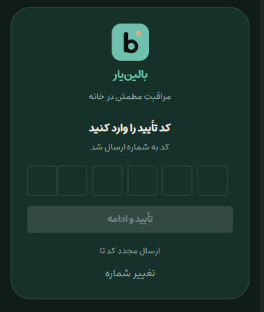
after submitting the phone number the otp input ui needs a better spacing, the first two input are stuck together. this is in fa locale, in the en locale its ok.
# nurse dashboard Start
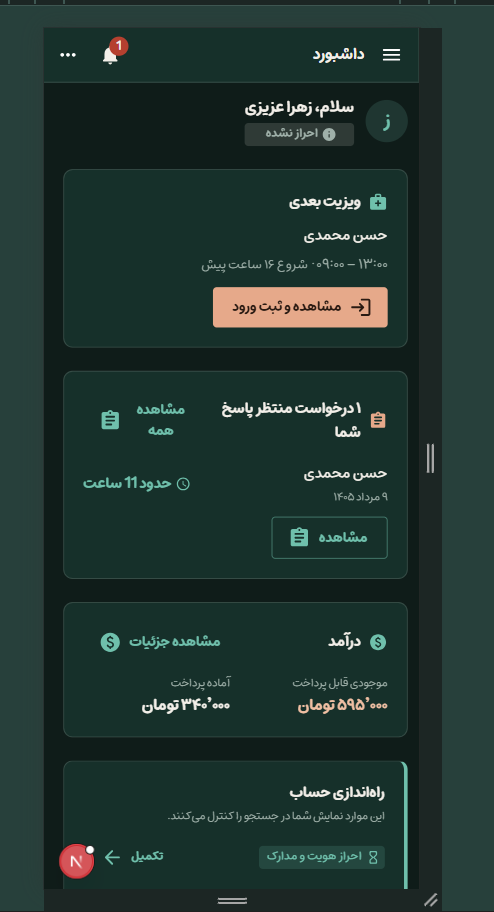

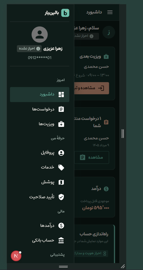
this dashboard should be totally refactorred,
the ui is kinda old and not a modren and with a good ux,
some text has not proper placing and some of them are too large,
the header and the type of accessing to the dashboard is too old style,
there must not be a header like that, and a side drawer, i modern smooth bottom navbar which have only three options ( as the groups of the drawer items are ) and just a forth item for the support and setting.
so each of the gropus of the side bar should have a root page which handles the links to the sub pages. and in those root pages its better to have a summary of that domain.
two notes:
- icons should be changed till here so i don't mention them again
- ui have much work to do to be acceptable.
there is a horizontal scroll in this page, this should not be like that,
the whole app should be scoped to a mobile size app, i mean if i scretch the chrome responsive mode, the header and the footer should have a maximum width not to strech and fit to the space
no matter what is the device view port, this should be a mobile sized app. all that sidebar in the desktop width is not needed, at least for now, we have to make the app very user friendly with a mobile user mindset